Apriority
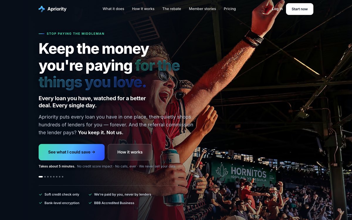
Apriority helps borrowers compare loans and keep lender rebates. The site needed to make that unfamiliar idea understandable before asking visitors to start.
Scope: eight-section, responsive single-page site; information architecture, copy and brand-led visual system.
This is a breakdown of the work, not a claim of measured conversion lift.
The problem
A visitor must understand what Apriority does, why a rebate reaches them, and what happens after they start. If those questions are scattered, the next step carries too much uncertainty.
The approach
I organized the page from the core promise through how it works, the rebate, trust signals and the start action. The brand system draws on Apriority’s mint-to-blue gradient while keeping the message readable.
What changed
- One central promise instead of competing explanations.
- An eight-section narrative built around the buyer’s questions.
- Repeated start points and clearer reassurance near the decision.
- Responsive layouts and a consistent visual system.
Evidence and limits
The image above shows the site work. A comparable pre-project screenshot and client-approved performance figures are not available here; I’m not presenting an invented before/after result or testimonial.
Visit Apriority ↗Want visitors to understand your offer faster?
Send your site and I’ll reply with three prioritized fixes.
Request a free teardown